Case Studies
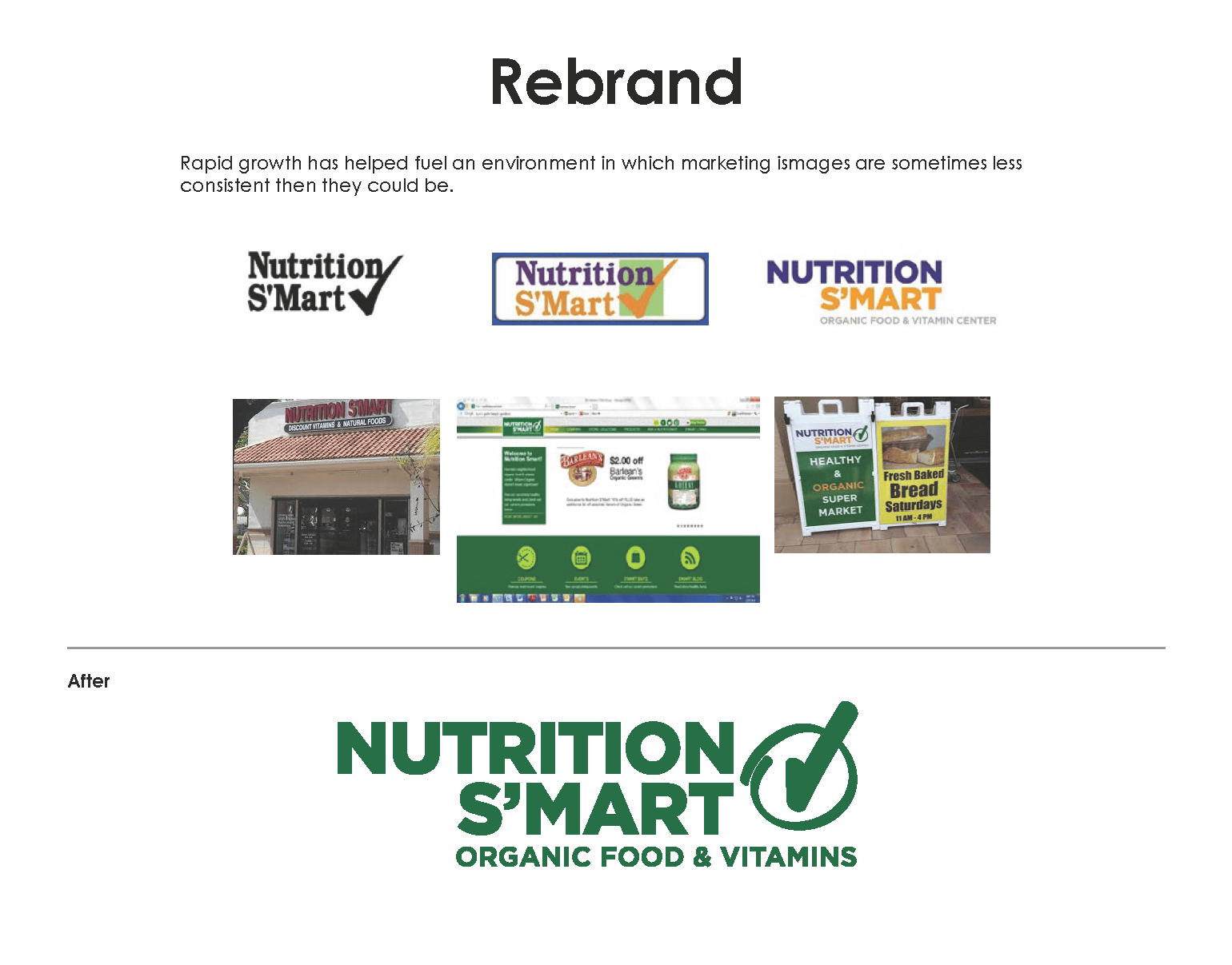
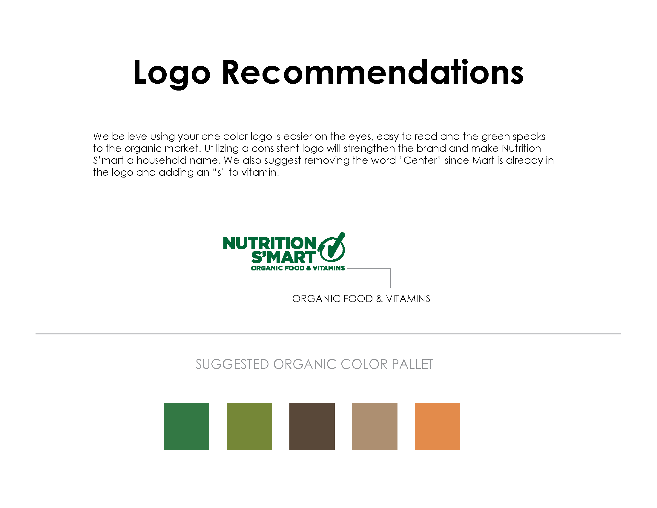
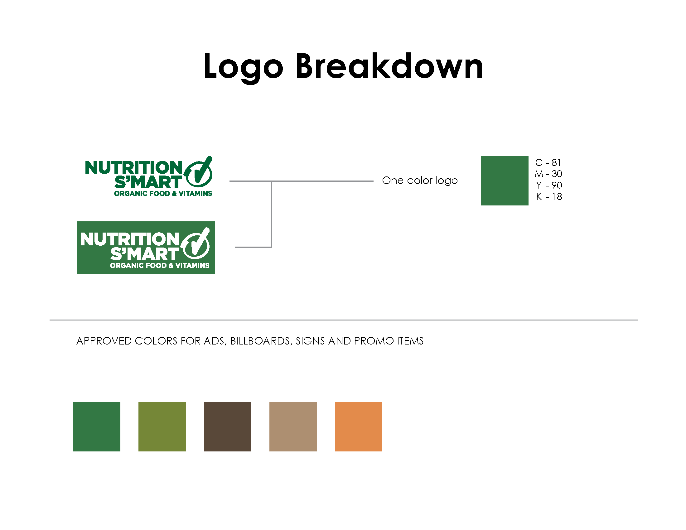
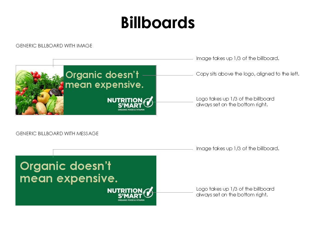
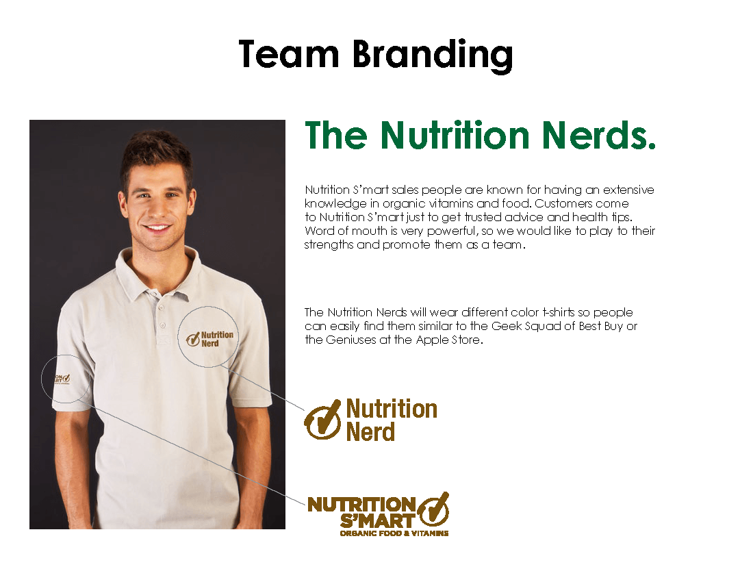
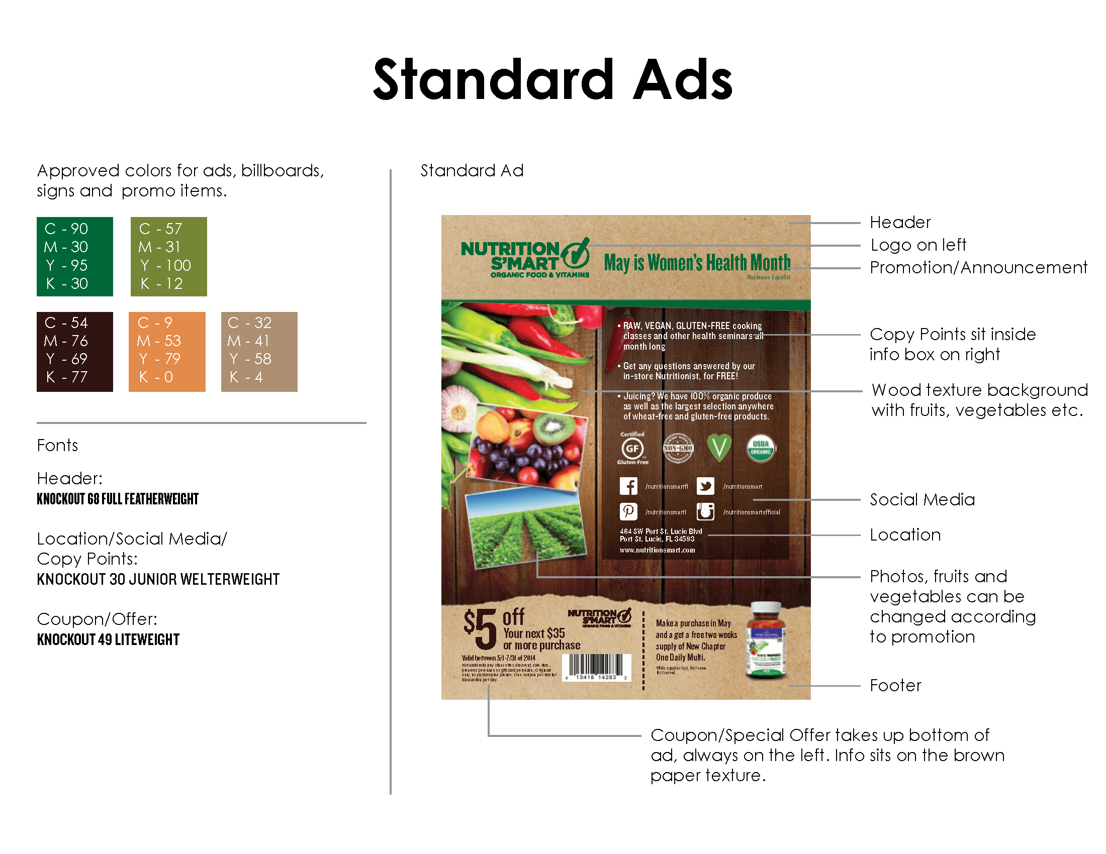
Nutrition Smart


Nitrofill
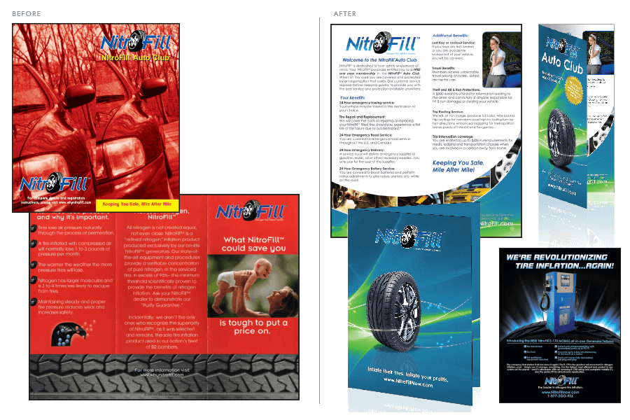
NitroFill, a National company with a patented NASA product that distributes Nitrogen tire inflation systems to car dealerships and automotive services centers throughout the United States, retained Redline Media Group to creatively rebrand collateral material, advertising displays and commercial signage. The existing creative was not representative of the technology and sophistication of the product offering. Inflating your tires with Nitrogen reduces consumer's vehicles fuel expenses. Utilizing NitroFill in turn burns less fuel, increases tire life, and ultimately saves you money. One of the colors selected for the process was green. As one of the main accent colors for the overall presentation, green signifies growth and subconsciously may tie the product, in consumers minds, to a green initiative.
Green typically also symbolizes a strong foundation to stand upon, the color green represents free passage in road traffic. The symbolic usage of this color may be interpreted psychologically in avoiding any unnecessary challenges along the way and can be associated with learning new approaches or perseverance. An additional color selection was blue. The color blue is associated with new beginnings and traditionally signifies the promotion of products in a loyal or stable atmosphere and often is symbolic with better opportunities and optimism. Through identifying a color scheme that we felt best attracted potential consumers, we established the new and improved visual and created greater brand identification for NitroFill. NitroFill has been extremely successful in furthering the growth of the brand through a more technologically creative presentation. The product line has increased in circulation and created a greater level of interest on behalf of consumers and distributers.
PTC
Had a medical feel to it, rather than reflecting PTC as an educational institution. The look of it was not appealing to the younger demographic PTC was aiming for.
Through updated graphics and bold use of color, Redline was able to reflect PTC's prestige as a learning instutition, and capture the eye of their target demographics.
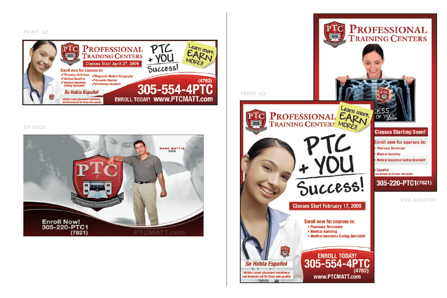
Professional Training Centers (PTC), a local medical technical training educational facility, retained Redline Media Group to redesign their logo and overall creative presentation to potential students. PTC's initial logo was consistent with elements found in the medical field but did not attract individuals seeking to make a change in their career path. Through Redline's creative process, PTC managed to re-establish their image through a prestigious and appealing creative visual. Through research and gathering data, a core target was identified. In addition, strategic planning and marketing models were developed in an effort to increase enrollment.
Through our research, we established that the target would be attracted to red. This selection was different from the traditional color of choice for educational institutions, especially related to the medical field. The color was chosen to attract a young target audience in search of change, as well as, individuals that have a desire to be successful, and have a survival instinct. The color red also signifies being bold and stepping out. This color was also selected to be incorporated within the logo and creative presentation to instantly display the text and bring supporting images to the foreground. Through Redline Media Group's rebranding efforts and a strategic marketing program, Professional Training Centers was able to increase their enrollment by over forty percent within one year.